I am so glad you all enjoyed my last post of my little recap of the MDD. Just for the record, like many of you, my favorite is
Kathryn. I would love to spend a day with her chatting about design, difficult clients, projects never completed, teenagers, dealing with being a D cup and how in the hell she came to know the fabulous
Jacqueline. Although, I'd probably be afraid to meet for cocktails knowing she'd drink me right under the table and I'd be the one asleep on some random chaise lounge or possibly the ground!
Even though the shows intro was a nauseating grand stand from each designer, and first impressions not the greatest, the series ended up being an entertaining home-run for me. That's a lot coming from someone who generally does not like reality tv. The stars personalities were as varied as their decorating styles and they did seem to grow on you as the weeks went by...some more than others.
Overall I liked something about each designer.
KI's house had the most inviting atmosphere,
MM is a pro at glamorous decorating. I'd like to see more of her style that is reflected in her book as well as something other than just the living room and office shots of her house. I loved the design and decorating in the upscale beach house
JAM, Ross and dog, Chessie call home.
MLB has such a devilish grin it would be almost impossible not to like him, besides I love his breathy Brit accent and want him to call me dahling!
NT we just didn't see enough of him and I really hope they show his house next season.
That said, before I deleted the series from my DVR, I snapped some pics of my favorite scenes that I thought would be fun to share with readers!
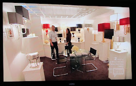
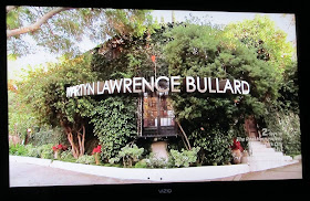
Martyn:
 |
| As a fellow chocoholic, this scene made me laugh, out loud! |
 |
Martyn shared exactly one chocolate with design assistant, Leura.
She seemed to have second thoughts about finishing the chocolate.
Or at least until she was alone. |
 |
| Close-up. Some things are just meant to be done in private. |
 |
Martyn dahling, can we just clarify that your client, JT, is not a celebrity by any measure.
This is a creepy guy who made a fortune taking video of girls on the beach,
mostly too drunk to realize they were half naked and being filmed.
He is however, "famous" from too many lawsuits to list...but hey, Google does! |
Mary McDonald:
 |
| Being MM's client can result in bodily harm as she explains in this scene. |
 |
MM's associate Nancy. She loves to disagree with MM and annoy her by not following instructions.
Not to mention, she has quite the repertoire of expressions too. Remember this scene when she had the movers
place the furniture how she wanted it....completely opposite of what MM said? Crazy. |
 |
| Sometimes MM gets steamed at her staff and clients. Is that a horn on the right side of her head? |
 |
| Whew, it's just a flyaway. |
 |
| But, it was enough to make these two stop and listen. Anyone, know who the girl in red is? |
 |
Was anyone else surprised to see that her staff worked in a black, windowless room?
Thank god for the monogram on the floor, otherwise on a bad day they might think they landed in hell. |
JAM:
 |
| Sometimes JAM is just a bit like dry toast. Two modes: whining and body obsessed. |
 |
| Cute boys taking a shower. AKA 2 golden pats of butter for JAM's dry toast. |
 |
| But Mr. Torso obsessed can surprise you....with a bang on Will Ferrell impersonation. Minus the funny. |
 |
| Or a cute baby bonding moment. Did you catch that full on smile that did not involve admiring his physique? |
NATHAN:
 |
Mr. Nice Guy.
Seriously, how many of your best girlfriends would go to the trouble of making you a boob cake based on a favorite fabric design! I can not wait to see what Nathan does for BF Mary's birthday!!! Let's hope he gets more camera time in season 2. Check out Jacqueline in the background. I wish I could rent her for one week just to up my cool factor.
Not that she deserves a present from her BF!!! After all the times he has been called upon to stroke her ego, she didn't think to name one stinking lamp after him???!!! Well, let it be known that his favorite lamp is also my favorite
lamp. So if I end up buying it from her new line for Robert Abbey, I most definitely will call it Nathan. |
KATHRYN:
 |
Kathryn in her sexy black birthday dress. I wore a similar dress for my birthday earlier this month and my cleavage was on full display too. However, it wasn't nearly as glam or expensive as this YSL dress. I needed a sale and a coupon! I think one of the most appealing things about KI is despite her design notoriety,
she seems quite normal...and interesting....and fun! |
 |
Ross liked Kathryn in her dress. JAM too. Secretly I bet he thinks he has better breasts.
See him intuitively checking? I feel confident he'll let us know next season. Although no one
made this gesture to express their excitement about my dress/breasts, I still felt sexy and was able to enjoy my birthday.
Just saying. |
 |
| KI's client Shannon in her signature glasses and outfit. It was perplexing and interesting, other than red lipstick, this spouse to the heir of Max Factor cosmetics, wore almost no make-up. However, she did wear plenty of black, which obviously qualifies her as a designer thus explaining why she no longer needs Kathryn's help. I wonder what the color scheme is for her baby nursery??? |
 |
Shannon's "overflow" room. I called it the OMG room and wished more than anything,
the moment I saw it, I wished that she was my client or that I was Kathryn's design assistant. |
 |
| When clients say, I want to work with things I have, it's not like this! |
 |
| I just wanted to whip out my check book and start shopping!!! |
 |
Truck day. I literally gasped when I saw the other "stuff" she had. But, fav Kathryn was less than excited. Even though most designers don't like working with all the items/mistakes clients have purchased, this would be the exception!
KI saw it as a jumping off point to re-do an old beach house SF just purchased. And just when we were all so excited to see the completion, SF has absurdly blamed KI for structural issues and fired her. Denying us of seeing KI's work. Dammit! |


