When it comes to bathrooms, I think what most people want is a beautiful and organized space. Afterall, it's where we began and end every single day. I think the second thing people want from a bathroom is luxury. When most people think of luxury, they think of luxurious materials and expansive spaces. I do too, but I also think of comfort. And, for these bathroom renovations, the latter was the driving force.
The majority of the my client's
renovation budget was spent on the kitchen, flooring and construction costs, so I knew the bathrooms would be a bit of a challenge. Not so much because of the budget, but because they were all very small. This townhouse had 2 full baths and 2 powder rooms. The 2 full baths were renovated 3 years ago. The full bath on the third floor, which was the largest, remained in good shape. It just needed a good cleaning, new cabinet hardware, mirror, medicine cabinet and lighting.
My focus was to overhaul the other three. Not only did I want to bring the spaces up to date, but I wanted to try to find ways to add luxury in the form of comfort, which for this project translated to brightly lit and better organized spaces. The only way to do this, given their small footprints and budget considerations, was to select materials that would give the illusion of more space. In order to accomplish this, I would rely on pocket doors, good lighting, floor tile set on the 45, vanities that had feet, sliding glass shower doors and plenty of bright white field tile!
I headed to the bath section of my favorite big box store and found myself scanning the isles and repeating their slogan "let's build something together" in my head. Thankfully, Allen + Roth rolled out a new line of products for Lowes last fall. I sourced the vanities and lights from them, Moen's new line, off-the-shelf tile and simple space/cost saving slab mirrors for over the vanities from my local glass company.
The Master Bath:
 |
Before
As much as I would have preferred a different vanity choice as I mentioned this one (just like the hall bath) was only 3 years old and in good shape, so it didn't make sense to allocate part of the budget to replace it.
After
New hardware was the only change for the vanity cabinet. |
I seriously don't understand the point of uplighting in a bathroom.
Why not just add a torchiere behind the toilet?
 |
After
Better lighting, bigger mirror. |
 |
During
This shot really gives you an idea of the changes. I dubbed this bathroom "the box".
This just may be the smallest bathroom I've ever seen in a master bedroom.
The shower was the size of a phone booth! But, not for long. Just behind the plumbing and pink insulation is the
hall linen closet, which was relocated so we could expand the shower.
I am a huge fan of pocket doors and this bathroom desperately needed one to free up valuable floor space. |
 |
Before
This in-swing door certainly contributed to the claustrophobic feeling. It was also a factor in the
moisture problems since it touched the shower base, plastic curtain and inhibited air-flow! |
After
Before
The before "before" from this
post. Cruel, I know to show this again, but
I really just wanted you all to have the full impact of the transformation!
 |
After
Goodbye, tiny, creepy, moldy box.
Hello, clean and pristine! |
 |
Adding a pocket door and sliding glass shower doors went a long way to help make this room feel more spacious.
Relocating the linen closet that was previously behind the shower added over a foot to the length of the shower. It was absolutely worth the trade off to spend on construction costs instead of making any significant changes to the hall bath. This bathroom will now feel more luxurious simply because it's brighter and more comfortable to move around! |
The Powder Room:
 |
Before
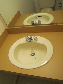
1970's harvest gold laminate counter. Usually, a floating counter makes a bathroom feel bigger. Not in this case
because it was so dark and chunky. It looked like it came from a cheap motel from the same era!
|
After
I thought this vanity cabinet by Allen+Roth had a lot of style for very little money.
I loved that it had feet, curved doors, a shelf and a drawer. Plus, a big white porcelain sink.
The drawer was a fantastic surprise at this price point!
PS: I had so much trouble getting this post completed, so let me apologize now for all the irregular fonts and spacing. I don't dare test fate (or my burning desire to toss the damn computer out the window) by trying to edit or add the other bathroom. I'm too afraid I'll lose it all, so I'll have to do in a separate post when I return.


