This client came to me via my blog, specifically via my friend,
Renae Moore who I met through blogging. Renae's talents are evident in the client's beautiful living room, which she completed prior to moving to Atlanta a few years ago. I don't know if I will ever be able to thank Renae enough for this referral, because this client would be any designer's dream client! She has been a pleasure to work with from our initial consultation to the final install. It's not often that the designer-client relationship runs perfectly smooth.
 |
| A little gift and thank-you note from me to the client. |
When I
first saw the space, my renovator instincts kicked in and I immediately wanted to move the closets which occupied what should have been the bed wall. Especially after the client told me that they wanted to make the switch from a queen to a king bed. Then came the bombshell- the master bathroom had been renovated in 2005 and a walk-in closet had been eliminated and 2 closets with bi-fold doors were added to what was, in fact, the original bed wall. And, in case you're thinking that the client made that decision on her own, you'd be wrong. She hired her first interior designer, an ASID designer.
 |
Details-Bedside necessities.
Things I think every bedside needs. I am giving a few of these faux shagreen boxes from the Nate Berkus collection at Target for Christmas gifts-what a stylish way to hide everything from hand lotion to the remote control! |
What The Client Asked For: a king size bed, but not just any king sized bed- they wanted a mechanical bed that both the top and bottom could adjust! Plenty of clothing storage, a wood headboard with footboard, possibly a mirrored chest and/or mirrored side tables and a slipper chair. Keep the existing shutters, shades, and carpet since all 3 were just a few years old. They didn't mind the wall color, but were open to a change. And if possible, the husband wanted to keep his armoire.
 |
| The embroidered leaf fabric was the inspiration for this bedroom. |
 |
| My drawing. Option #1 was selected, although we did go with more modern sconces shown in another drawing. |
What I Proposed: I had the client and her husband choose the bed first. After sourcing several fabric options, the client fell in love with an embroidered leaf fabric. It quickly became apparent the wall color wasn't going to
work. I suggested a color scheme of blue-gray and cream with hits of smokey lilac. An upholstered headboard to keep the large bed from taking over the small room (and definitely no footboard), a lighter/fresher paint color, wood bedside chests (I'm not a big fan of mirrored chests because they are so hard to keep fingerprint free and they chip/crack easily). A desk/dining style chair since a slipper chair would be too deep to move freely around the bed and vanity. But more importantly, it would be too short to do it's main job- which was to camouflage the sink vanity that was measured incorrectly and extended beyond the wall edge! The shutters were beautiful and the white matelasse roman shades were well made, but needed a height adjustment for light control, as well as give a lift to the 8ft ceilings. It did pain me to leave the existing carpet since I always like to start with the floors. And, the germaphobe in me strongly dislikes frieze carpets and this one was not wearing particularly well. But it remained, as the king adjustable bed was a heavy hit to the budget. Oh, and of course, no project of mine would be complete without pretty door
hardware!
 |
| From the moment I first saw this Bombe chest at Crate & Barrel over a year ago with it's Acanthus-like scrolls lining the drawers, I knew I wanted to find a way to use it in my house or in a client's one day. I initially proposed an incredible Neoclassical mahogany chest with concave drawers for this client's bedroom, which she loved. But at more than 3 times the price, it wasn't the best way to allocate the budget. |
 |
Details
Classic with a bit of modern-my favorite! |
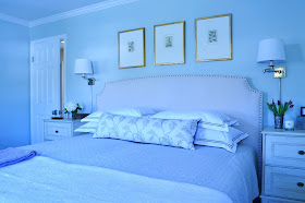
The End Result: A soothing palette of creams and blues with a bit of smokey lilac and few dark pieces to keep the scheme from being overly feminine. The upholstered headboard I selected took some convincing, but I knew a wood headboard would overwhelm the small room. Same went with the cherry armoire, it was just too imposing and drained the room of natural light. I think the dark chest and burl wood mirror show how it is possible to have dark pieces incorporated for that bit of masculinity and still achieve a light and airy feeling.The bedside tables were a huge challenge due to space constraints combined with the need for storage. This is where we splurged, and it paid off! The glass and iron table next to the chair delivers on the bit of glamour the client wanted without the upkeep of mirrored chests. I don't think you can
ever underestimate the power of proper lighting and artwork to transform a space! A few accessories and fresh flowers and it was time to turn this room back over to the clients...
 |
Before
Dark and dated. |
 |
After
Light and bright. |
 |
I always prefer to use a different fabric and/or design on each side of a decorative pillow.
It prevents boredom and is a great solution if you like a change with the seasons! |
 |
Before
When the client's daughter came for a visit, she said the room looked bigger and thought her parents kept the queen sized bed afterall! The fact the room looks larger has much to do with removing the boxy armoire, raising the shades as well as changing the wall color. The wall color turned out incredible-it changes from light blue-to gray-to pale aqua! |
 |
After
Although it is always preferable to see the bed from the door, the unusual curves of the large burled wood mirror provides enough interest to welcome you in! This is an example of how dark pieces can be used without weighing the space down. |
 |
| The "boob" light in the ceiling had to go! I replaced it with this classic glass bell lantern. |
 |
And, since these sconces were installed too high and the walls were going to need to be patched,
why not update them too? |
 |
| Since there is a sink vanity in the room, I had to give it a little spruce up with new sconces, a linen hand towel and jar of pretty soaps! We talked about painting the sink cabinet cream to match the bedside chests. Maybe one day along with new carpeting. For now though, the client loves her new room and isn't that all that really matters in the end? |
Sources:
All Lighting- Visual Comfort/Circa- Charleston, SC
Bombe Chest and headboard- Crate & Barrel
Cream bedside chests and Curvy burled wood mirror-To The Trade
Glass and iron side table and leaf series over bed- Ethan Allen
Purple silk velvet and leaf embroidered fabric- To the Trade- Kravet
Pillow Shams/sheets-Restoration Hardware Outlet
Throw- Bloomingdale's
Glass water carafe- Pottery Barn
Shagreen box on bedside table- Nate Berkus/Target
Candle- Linnea's Lights
Clock- Savannah's of Leesburg
Door hardware- Baldwin Brass
Paint- Benjamin Moore. Wall color: Night Mist , Trim and doors: Linen White
All other items are one of a kind or discontinued.


