


 |
| 10 bed pillows and no bench at the end of the bed to even pile them on each night! |
Here's what they said:
- Too many pillows on a bed.
- Absurd quantities of flowers-a little goes a long way
- Antique sofas-sofas are for sitting.
- Themed rooms-they belong in amusement parks.
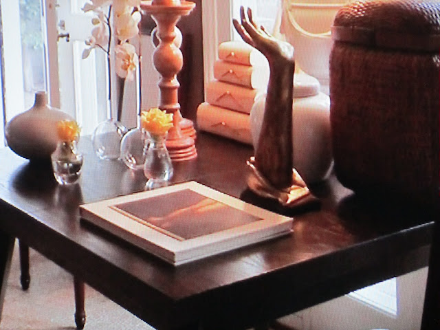
- Candlesticks: "A single one, maybe, or groups of three or more can be nice. But two perfectly placed side by side simply drives me up the wall"-Albert Hadley, NYC
- "Bare lightbulbs" Benjamin Noriega-Ortiz, NYC"
- All-white or all-beige rooms. Who lives in them? Obviously someone who never reads a newspaper" David H. Mitchell, Washington, D.C.
- "Collections of small objects on every surface"Charles Spada, Boston
This is suppose to double as a dining table, seriously. It looks like a shop display!

- Too many pillows on beds and sofa's.
- Too many accessories, especially the discount and/or retail variety.
- Too much faux fur.
- Inadequate lighting.
- Chairs that don't have a table close by to set a drink.
- Fake flowers and plants. And dead plants!
- Tall, dark, heavy pieces of furniture that are poorly placed.
- Kitchen counter clutter.
- Plastic or painted switch plates.
- Decorating with items that are off season or are off geographically. For example: if you don't live at the beach, seashells shouldn't be on display in January and if you do live at the beach, while I don't think you need to decorate "beachy" I wouldn't want to see a room decorated with antlers and fur!
 |
| I guess you're suppose to sit on the chairs and just admire the 9 sofa pillows! Too bad they're unattractive. Especially the Chewbacca pillow, it looks dirty. At least the rug is stunning. |


I know its trendy but I hate typography art. Not a fan of kid's rooms that are too circus-y and and have the child's name on the wall. TVs over a fireplace.
ReplyDeleteKerry, I share some of these as well!
DeleteDitto to all ten of yours. Mine would be:
ReplyDelete1. too many graphic prints in a room, trying to be on trend and just missing.
2.Zebra rugs, so over them
3.Sea grass, so over them, never did like them.
4.painting everything in chalk paint, one piece
makes it special.
5. All white interiors, pretty but lackluster
6. dish towel hanging on the handle of a stove or
dishwasher.
Okay I had better stop or you are going to have another post on your post, lol
Kathysue,
Delete#6 has me wondering?
Me, too. That is weird. Where else would you put it if you have a small kitchen?
DeletePlastic cheap flowers or faux plants (unless they look so real we have no idea)
ReplyDeleteChevron fabrics and mixing all kinds of funky colors, over that look
Tons of chatchkey little trinkets adorning a table or end table
A chandelier that is too small for a space or hung too high
Shoddy workmanship on drapes or drapes that don't touch the floor...kind of like highwaters in pants, just not attractive....
Wow I am surprising myself with how easily these are flowing. Better stop now, I am sounding difficult but truthfully I like seeing different interpretations of design but do think there are few things that just don't work anywhere like the things above......interesting and fun topic.
What an interesting discussion.
ReplyDeleteHmm, too many pillows would be a big one for me too, it even drives my husband crazy when we go to someone's house where you can't sit down.
Rooms where everything looks like it was bought from one place and at the same time, or the fabrics are all matchy, matchy.
Rooms that are so formal they look like a museum, not welcoming at all and you are afraid to sit down!
My biggest pet peeve though is when a space has no personality, I call it the model home look, where it was designed to appeal to everyone and represent no one...so boring! I want a room to tell me something about the owner, even if I never met them.
Great post!
Kat
Hmmm..I could write a book...but I won't...no time!;>)
ReplyDeleteI don't like bedrooms where the bed hangs over the windows or where there are large pieces of furniture placed in front of the windows.
I am tired of seeing the "jackknife cut" on pillows.
Too many matchy-matchy pieces in a room (the way MyHero likes to decorate)-let's go somewhere and BUY A ROOM...uh...let's NOT!
Books on display for display only- that have never been read and probably never will be read.
People pleasing decorating...where a person decorates so that things look good for others but there is no sense of the real person behind the design.
And...I hate to say it...but I am getting just a tad tired of burlap....please don't sent fire bombs!
I think I will quit before I really insult someone~
(1) Surfaces covered with layers and layers of decorative objects -- no place to put anything down
ReplyDelete(2) Latticework prints
(3) Lucite
(4) Flea market chic
(5) Eclectic
(6) Curated
RD, I was so intrigued by your list!
Delete1. Typography as art, just not my thing.
ReplyDelete2. Animal print anything, over it.
3. Drapes should just touch the floor, just enough to "break"; I hate seeing an extra yard of fabric puddled on the floor.
4. The front side of bathtubs encased in wood and/or tile -- just ugly.
5. Using 12x12 tiles on tub and/or shower surrounds. Those belong on the floor.
6. The chalky/Belgian trend -- I can sort of appreciate it for what it is, but couldn't live in it. It makes me feel... chalky.
7. Pot lights all over a ceiling -- awful.
8. Open shelving in the kitchen is pretty but I don't want to be dusting my dishes. Or scrubbing airborne cooking grease off them.
9. Slipcovered dining chairs -- too bulky-looking and it makes me wonder what grimy secret you're hiding under there.
10. Every possible corbel and ornate molding piece glommed onto kitchen cabinetry. Less is definitely more.
Add:
DeleteThose tram stop/ train station black and white billboards used as art
Bed hangings - lovely to look at, but we all have hay fever
Dried flowers. Need I say more?
White on white on white
Overly styled book cases, that look like a shop display
Kitchen shots with bright green bottles of mineral water ''casually' lined up
Metal feet on sofas. I'm more of a traditionalist
Just stayed this week in a fabulous resort on the Gold Coast. Stunning bathroom with one of those huge, ceiling mounted rain shower roses. There was no way I could keep my blow dried hair dry. I prefer a demountable, adjustable hand held rose, thanks,
Leather three piece suite. Anything too matched, too contrived or self conscious.
Great to get that off my chest. Very therapeutic.
Cherill W, Adelaide - South Australia
Sandra,
DeleteI totally agree with your #7. I only have a few in my own house as I prefer Swiss cheese on a sandwich!
Anon, I know what you mean about the green bottles, I've been guilty of that, but I want to say more for parties?
Sandra for #10, you need to check out Just Beachy! She is doing her kitchen and it is horrible with the corbels everywhere and molding on top of molding. She should have just left it up to the builder.
DeletePictures that are hung too high.
ReplyDeleteOh, I have been dying to write a post like this for a long time, but stop myself so I don't offend anyone!! I have a long list, but mostly it is those uncomfortable sofas that irritate me - either those severe antique ones (lovely but uptight) or the ones with the low backs that don't support you. And I hate all those stupid monstrosities at Restoration Hardware.
ReplyDeleteAs much as I love the look of natural rugs, I really think that sisal and seagrass underfoot must be unpleasant. It bugs me that it is so ubiquitous and I want to have that exact look but I refuse to be uncomfortable. So I am just jealous. But really, we like soft and comfy underfoot, not loofahs....
I am getting sick of starburst mirrors, although every 2 months I almost buy one because they really are classic. But somehow, unless you are Phoebe Howard or have a good antique one, leave the crappy Chinese ones at Ballard...
I really hate beachy rooms - maybe at the beach house in Nantucket you can do it.
I really really hate ironic rooms, like those bloody Jonathan Adler rooms. I hate everything about his stuff but think he is wonderful. I just hate mid-century and ironic figurines that cost $400 each.
I hate anything BOLD. I hate red. I hate large collections of blue and white chinoiserie. I know all the old money crowd has all that stuff and I really really want a chinoiserie lamp, but I am also totally sick of it.
I am sick of little white dogs.
I am sick of farmhouse feminine looks. I am also sick of trying-too-hard boho like Anthropologie.
Oh...I must stop.
Can't wait to read all the comments and sorry if I offended anyone. As soon as I sign off, I will think of more things...
xo Terri
Terri,
DeleteI applaud your honesty and found this list to be quite interesting!
He he he.
ReplyDeleteCushions up on their end points.
Yep, star burst mirrors.
Zebra skins - but 8 have seen a lovely pale acquaint/white zebra stripe wallpaper. Great for a dressing room.
Gourd shaped lamp bases. I HAVE loved them, thanks to Adler, Nisbet
*** Oh, now THIS is "easy-peasy"!
ReplyDeleteMY PERSONAL, #1 "HANG-UP: RUGS that are TOOOOOO SMALL for a space (And yes, ANY rug that is simply "out of scale" for the space it's in!!!)... When I see a rug/carpet under a DR table, and one can't even pull the chair back without starting a war or getting injured, it B*U*G*S me to nooo end! There! I said & admitted it!!!
(2) A "just there" space that tells ABSOLUTELY NOTHING of the people who USE the space~~~ (or DO they?)... Basically, just a boring room~~~
(3) False refinement (ala "my" precious Billy Baldwin)...
(4) Bed/nightstand lighting that is just WAAAAY too small... same with a "nightstand" being to short and/or too small...
(5) The lack of a variety of textures...
(6) Beds toooo low to the ground (except in cases where they're MEANT to be low!)...
(7) Glass doored fridges... Maybe I'm "JEALOUS" (because one has to be able to keep it VERRRRRY N*E*A*T!), but what REEEEALLY BOTHERS me is the fact that I find nothing interesting in viewing condiment jars, salad dressing bottles, etc. Just plain old ugly & certainly not EXCITING to see, don'tchathink?!?!?!
(8) Cluttered countertops~~~ in the kitchen, bathrooms, WHEREVER!!!
Wow!!!~ That was FUN to just spout off "without thinking" (which of course I TRY not to do very often!!! That's NOT the way to "Win Friends and Influence People", that's for sure! SMiles!)...
Now I must read and see what bothers the others... am sure some of THEIR "annoyances" are mine too... these are just "the first things" that came to mind!!!
***** MAY I ADD O*N*E THING to this that I REEEALLY LOVVVVE?????... A charming home filled with love, warmth, laughter, family, friends & pets! Now THAT'S "the good life", IMHO!!!
Thanks, and best wishes,
Linda in AZ *
bellesmom1234@comcast.net
I have the same pet peeve with underscaled area rugs! They look like stamps on a letter!!!!! Also with the nightstands being too small ans lighting being underscaled!!!!
DeleteTheme-y anything!!! But especially in design! People confuse "styles" with "themes"... and therefore, go overboard.
Generic designalso drives me nuts!
Puddle or too short draperies!!! And how about those really skimpy drapery side panels???
Ok... I vented! I feel a LOT better!!!!
Really , really hate people who write comments in CAPS!!! Annoying.Please stop.
DeleteI had to laugh when reading everyone's comments, this was rather fun Rebecca but the truth of the matter is everyone has personal tastes. While some of the pet peeves people hate I like and vise versa. So I'm not going to add to the list but you have to remember rooms in magazines are styled for photographic purposes. I've had our home shot and they clump things on tables because who wants to see an empty table in a magazine it looks stark. Way to go Rebecca you've gotten people to really speak out and this is a post I've really enjoyed.
ReplyDeleteHugs to you my friend!
Debra~
Debra,
DeleteWell your right, there is no accounting for personal taste, Of course, the best rooms are the ones that combine it with style! Or, as you point out, the ones that were styled wonderfully. I style all my work before I photo it to get the best outcome possible and hope that it reflects real life too.
How about too many family pictures scattered everywhere. Feels like I'm being watched. And, when they are put in cheap frames, the worst! Don't even get me started on the gigantic family portrait, you know the kind where everyone, including fido is posed on the lawn or the kind where the family has the matching clothes on...LOL!!!
ReplyDeleteThis made me laugh out loud!!!! I agree on every count!!!!!!
DeleteI agree. Pictures hung too high, many, many family photos placed in the most public rooms f the house (save for the bedrooms and private spaces), too beachy rooms abounding with seashells and other nautical collectibles, plastic chairs (even lucite), chalkboard paint (teachers have waited years to get rid of these boards from their classrooms!), vertical blinds, too much "decorating" which looks ostentatious. I do, however, paint my light switches to match the wall paint which I see as more pleasing than the plastic ones installed by the builder. Metal ones are also nice, but constantly need cleaning because of fingerprints.
ReplyDeletebest,
teaorwine
Too much stuff is the biggest. Makes me claustrophobic.
ReplyDeleteToo many candles in one room.
Too many pillows on anything.
No place for a drink.
Places to sit that are a designer's dream but uncomfortable as all get out.
a pop of color that doesn't relate to anything else in the room
A look that says no one lives here, it's all for show.
The all white look.. so sterile and even though the textures add interest, it's bland.
I'm stopping there..
What an enlightening post this morning. Loved all the comments too!
xo marlis
My pet peeve is when people can't appreciate other peoples taste. I don't want to open a magazine and only see my house. I don't want to go visit a friend or neighbor and walk into my house. My pet peeve is when people judge someone who has a clean , white interior as being a bad mom or unimaginative. I have five happy kids and a dog. They live freely and comfortably in our clean, white slipcovered home. I believe our home actually encourages imagination and creativity rather than forcing it . I don't mean to offend anyone ; only defend the choices I have made.
ReplyDeleteSlipcovers being the operative word! You go, girl--if you want a white house and it works for you then no one should criticise. My pet peeve (see below) are upholstered white chairs where you must live with the paw prints and wine stains and sticky fingers. Too many designers go the all-white museum look when it's not practical to do so--leaving you with a sterile and cold environment. You have obviously struck a happy balance, and any house with five kids and a dog can't possible be cold or boring. :)
Deletelizziefitz,
DeleteI think white rooms are criticized as much as rooms that have huge amounts of color or pattern. Most people think they have good taste. I have seen some very stylish white interiors that I've admired. Though my personal style is traditional, I love seeing other styles and always appreciate the beauty of a room that is well executed!
1) TV over the fireplace!! (Really...are you so A.D.D. that you can't just releax with a book?!?)
ReplyDelete2) Books by the yard, or coordinated by color. Leave them in the store for someone who actually reads.
3) Equestrian theme when you have never stepped in horse poop. Unless you live in Middleburg, Lexington, or Wellington, et.al., don't try to pretend you're something you're not.
4) White upholstered chairs, unless you live in a bubble they just don't work.
Tough crowd! Ha!
ReplyDeleteOverly styled (and explained via an extensive narrative) rooms that look terrible (to me...but what do I know?)
Oak furniture
Animal prints
Shag carpet
Embellishments (fringe, decorative finals, etc.)
Faux antique
Color photos in cheap frames with no mats
Pandora's box has been opened! :)
Can't stand how magazines always show beautiful rooms and lamps placed in places where there is no place to plug in. I hate seeing cords dangling or drooping or stretching to the plug. I will do anything to make sure they are concealed.
ReplyDeleteOver decorated homes with 'stuff'. Suzanne Kasler says a home should be collected not decorated.....love that. I used to do commercial displays, I don't want my home looking like that. Refrain from shopping for 'stuff' just to fill a space and thereby making it look like some shop display. Find things with meaning.
Cluttered kitchen counters....put the appliances away. It burns more calories to get them out and put them back! :)
I'll chime in on the art hung too high - eye level people!
Slip covered furniture - s simply b/c I am too lazy to launder and take care of them.
Seagrass everywhere - impractical, don't want to have to replace every few years.
Everything symmetrical - how about a little asymmetry? It spices things up a bit!
Ok that's probably enough!
Great post Rebecca....love hearing other's thoughts!
I can't thank everyone enough for joining in this discussion, its's absolutely fascinating reading what everyone has to say!
ReplyDeleteLove this post...I am glad you started the discussion for us. I must say I agree with many and have been guilty of a few over the years. I did go through the too many pillows faze!
ReplyDeleteLove this post! Off the top of my head,
ReplyDeletebookshelves with only 3-5 books per shelf
dated oak kitchens that have been painted out but still look like old builder cupboards
children's rooms that don't have child-accessible bookshelves
televisions out on display, or "hidden" in such a way that the furniture layout makes it obvious there's a television in that cabinet.
tabletops completely covered with picture frames
period houses that have been decorated in a contrasting style (particularly if this includes fairly permanant decisions, like installing a modern kitchen in an old house,)
cornice trim or baseboard which is too narrow,
badly done murals or faux finishes (though I can love either of these if they are done well)
plates hung on bathroom walls or birds nests/feathers used for centerpieces on dining room tables. I'm not grossed out by much, but something about these combinations honestly presses my 'ick' button.
Hello Rebecca
ReplyDeleteWhat a topic and I loved reading all the comments. I think all is covered already.
I like to see the personality of the owners present and to see original art and items collected, with love, over time. I also love to see a kitchen that is used for cooking and entertaining and not merely for show.
Thanks Rebecca
Helen xx
Hi Helen,
DeleteI dream about great art! If I ever won the lottery the first thing I would do, if I'm honest, is to buy beautiful works from all the artists I love!!!
Having spent the last year fixing up & then selling my house, and then hunting for a new house, I realize I have many pet peeves, most in the kitchen. 1) Microwaves over the stove. Dangerous to remove HOT dishes from above shoulder height and no proper outside ventilation. 2) Microwaves under the counter. Equally dangerous and a pain to be doubled over to monitor cooking. 3)Cooktops set into islands with pendants hanging over them. Who cleans the pendants? Where is the ventilation? 4) Refrigerators which don't fit - they protrude or gap. Common even in very expensive houses. 5)I have never liked oak cabinets. 6) Laundry rooms with no window. Can't see if stains are gone. 7) Laundry rooms with no sink for handwashing items, or stain removal. 8)Lack of tables to put drinks on. 9) "Twee" decorating conceits. The desk with a quill pen on the desktop, as if somebody uses it. 10) Generic displays which say nothing about the people who live in the house. "Merchandizing the room." Seems fake. 11) Worse, bookcases with books bought by the yard. 12) Worse yet, houses with no bookcases. 13) Lack of good lighting for reading & magazines. Phew...got that off my chest. ...That said, I love the bedroom above with the starburst mirror. Many of these current trends don't bother me. If a trend smacks of being phony, pretentious or inpractical, then it's not for me.
ReplyDeleteGreat post! Can't stand ANY clutter, and rows and rows of books that are antique and merely decorative in a book case. xx
ReplyDeletePlease.... all of these "rules" are ridiculous!! I live in the Northeast not anywhere near water, and I love shells and naturally shed antlers for decoration. Nothing is more beautiful than nature... so why not bring it indoors?! Who says I have to be near a beach to use shells for decoration?!! White rooms also work wonderfully for me. They are restful and calming coming home to. AND I have kids, dogs, etc. White just lets you know when you need to clean. Darker/brighter colors just trick you into thinking things are clean when they're not.
ReplyDeleteSpeaking to "Windlost" comments - sounds as if you don't like anything unless you've deemed it "good decorating". Where did you get your Interior design training?! Oh, that's right.. you don't have the training. Hmm. And sick of "little white dogs"? What does THAT have to do with design?
Lisa
Hi Lisa/Anon,
DeleteThis post is absolutely not about rules. It's about PEEVES. There is a big difference. I personally don't have decorating rules. I approach each project/design with client's style and budget as the top priorities. Then, do what they hired me for: design a functional, inviting and beautiful room to accommodate their lifestyle.
If you are a regular reader of my blog, you already know that I fully embrace natural elements and talk about them often. However, I just can't get on board with combining antlers and shells. I love them both, just not together. It peeves me. In my opinion, it looks un-natural to pile them together on a mantle or tray. It looks like your trying to hard to "create" the appearance of regular strolls on the beach and through the woods. Maybe it peeves me because I so often see this in suburban homes. Or maybe it peeves me because none of the beaches I visit have any antler shedding wildlife running on them. I like design that is authentic. Authentic to the person AND the environment.
I have no problem with white and addressed this in a comment reply already. I also like dark colors/fabrics. I always assume anyone interested in beautiful design is dilligent about keeping upholstery and rooms clean, regardless of their fabric choices.
As far as Windlost, she is entitled to her opinion, just as you are to yours, regardless if either of you have design training.
What a fascinating topic! As in all of life, one man's junk is, indeed, another man's treasure.
ReplyDeleteI enjoy a house that is comfortable and stylish. I don't like trends, preferring the classics in architecture, furniture and fabrics. I would rather buy something meaningful and lasting than something that is "in" for about five minutes. Possibly with the internet, some of the classics, like sunburst mirrors, have become overdone, but I still love them.
I also like sea grass rugs (wall to wall), antique Persian rugs and hardwood floors. My pet peeve at the moment is a tile floor in our kitchen that is painful if you are trying to work in there for several hours cooking or entertaining.
I have likes and dislikes of my own, but I don't try to impose them on others. I am sort of a live and let live kind of girl. Still I have a long "don't put it in my house list" that I won't bore you with, but some of the things mentioned above are definitely on it, and some aren't.
You should read May House Beautiful. 100 Comments from decorators and each one canceled out something someone else said. Always use white paint, never use white paint. Have a bench at the end of the bed, never put a bench at the end of the bed. It is really quite funny.
ReplyDeleteI just came across this post and love it! I have a few "peeves" of my own, so I will begin, ;o)
ReplyDeleteObvious shopping from "Home Goods"
Decorating that is too staged
Zebra and cow hide rugs
Chevron, greek key, ikat....enough
Lucite....anything plastic, trendy and retro
bright yellow, orange or purple (hey, it's my comment!)
Paintings that were purchased to fill a space, hung up too high, of course
TV's over the fireplace
Two story foyers
Oak cabinets
Tile floors except in bathrooms
Palm trees except in Florida or CA (hate these)
Open shelving.....fad, trendy,contrived looking
Chalboard paint.....this is so bad
All white interiors....again very dated and trendy (love slipcovers, though...classic)
Typography....just wrong
Words or wooden signs with sayings on the wall.....not good
Too much painted wood furniture
I have to say it....someone has too.....shabby, chippy, chic......
Houses that look like a gift store
Track housing, two story foyers, canned lighting
Antiques and traditional furniture works perfectly and is timeless and classy. Your blue and white will last forever and so will your gorgeous Hickory Chair furniture!
Add reproductions to the list. I have a low tolerance for them, whether good or not. This goes for art as well. A print is a print. Buy something original.
ReplyDeleteMid century modern. Boring. Overdone. Everywhere you look. It's what too much chintz was to the Eighties.
Interiors that look like hotel chic, devoid of all personality.
Too much clutter is one thing, but not enough is even worse.
Ridiculously expensive does not necessarily equate to good.
Furniture or objects that are not properly scaled to the room. Ditzy looking chairs in a small room.
MacMansions.
Houses that are too much like museums, too precious. You feel as if you are unable to sit down and be comfortable lest you break a chair leg or spill something on the silk upholstery.
every home i do....
ReplyDeletei insist on dimmers on all the lighting.
i hate harsh lighting.
i love atmosphere.
xx
Pale or all white interiors
ReplyDeleteFaked patina
Deconstructed (to be polite) Resto Hardware "furniture"
Impersonal decorating with no story to tell about the owners
Bookshelves with no books, books with backs facing inward, "trophy" books no one has read
Microwaves in general
Burlap as upholstery. Really? You want to sit on that stuff? And...it smells bad!
Expensive cabinetry for a kitchen. A kitchen feeds the soul and messes happen in them.
Trends
I love red, love leopard, love fabric, love deep saturated colors, love mirrors. I alone can be the bad news list for most everyone else. When I walk into your pale house with nary a piece of color and you exclaim, "Finally, this house is so ME! I can say "I am happy for you." And mean it. The difference for me is when a room has a conversation with its owner not a xerox copy of a magazine.
Boy did you open the flood gates with this topic! This should be a weekly post!
ReplyDeleteIm not big on cheap reproduction art...I like fine art, and even if you can't afford much you can pick it up at art shows...or giclees from the artist of something you covet- that means something to you.. This is really amusing, I love the responses!
Nancy
Powellbrowerhome.com
I don't know if it's because I know too many dysfunctional people or if I'm just a witch, but wall motto decals are a pet peeve of mine. I recently walked into a living room where the saying "A family is a journey to forever" was plastered across the main wall in huge cursive and it was hard not to shake my head because the inhabitants of that particular house are a parody of a happy family. I know, I'm a witch ...
ReplyDeleteI live in what I think is a very beautiful English-country-style home in the northeast, but it has quite a number of items of questionable or, let's face it, ridiculously bad taste introduced by my six-year-old twins. Birds' nests, lava, seashells, Navajo souvenirs, hideous vases from yard sales given for Mother's Day -- all here. Of course, that isn't exactly an interior design decision, but I do like homes that incorporate the stuff of relationships. Not surprisingly, I am always sort of horrified by those highly stylized children's rooms you see in magazines, where even the toys are chosen to showcase the parents' taste.
ReplyDeleteMine is matchy matchy furniture...where the room looks like a furniture showroom.
ReplyDeleteThis has to be the best post which really differentiate "decorators" from designers. Floorplan is the #1 key in good design, less is more is my motto. Thanks for a great read of what not to do. Loved it!
ReplyDeleteInteresting post! It was fun thinking about it and reading though the comments. I myself have three pet peeves:
ReplyDelete1.) I believe it is called a "chair and a half". Ugh! Entirely useless if you don't have small children or don't weigh 700 pounds. Not to mention unsightly. We made this mistake as a young couple and I am still begging my husband to let me give it away and replace it with 2 separate chairs or a loveseat.
2.) Visible workout equipment. Due to space limitations, I am a victim of this myself... and no matter how I justify it ("I use it everyday!") it is still ugly!!!
3.) Curb appeal... this isn't exactly in the "interior decorating" category but it is related and just as important. We recently moved to the Pacific NW and over zealous landscapes crammed with too many plants are ubiquitous. One Japaneses Maple in your front yard is just fine- you don't need 5!
People who call themselves designers when the world's best call themselves decorators.
ReplyDeleteI say "amen" to much mentioned here. My list includes: faux plaster walls, plastic or silk plants/flowers, lucite anything, animal hides or antlers or trophies, new "prairie" furniture, cast coral, Mao immortalized (the despot was responsible for crimes against humanity) and Marilyn immortalized (why continue to glamorize an unhappy woman who committed suicide), horizontal stripes, over-sized industrial pendants in refined spaces...The ever-faster moving design trends that render out-of-date perfectly lovely styles.
ReplyDeleteYes, we all have our own tastes, style, history, etc., that comes to play when we decorate. As one who owns a business that cleans homes and their contents after a fire, let me just say....whatever look appeals to you, it is quite tacky to leave price tags on your items. THAT bugs me more than our differing of opinions as to what looks good in your or my home!
ReplyDeleteA house without a flow between the spaces feels disjointed. Rooms need to somehow relate. I also dislike a house with too much packed into the rooms-on surfaces, floors and walls. It is the space between the notes that makes the music.
ReplyDeleteRebec ca. This is a great one. I agree with all of yours. I bet we could get together and dish for hours over this. Xo. Mona
ReplyDeleteHi Rebecca,
ReplyDeleteI just found your blog and have been reading many of your fantastic posts, but I just had to comment on this one! A friend has 2 giant family portraits, one is the family wearing white shirts and khaki shorts on the beach and the other is on the lawn all wearing jeans and black shirts that includes fido as someone pointed out. She has them hung in their main gathering room. I personally think people who do these portraits are shallow and vain. It makes me so uncomfortable to be forced to look at them and she definately wants people to say are wonderful they are. It's a relief to see that I am not alone with this peeve.