Friday, February 25, 2011

The Death Of The Duvet

I am officially over the duvet cover as a desirable solution for bed dressing. At least at the A&A house.


I recommended a near identical one to this for a client. It looked this good
when we first put it on. After it's first washing...a wrinkled mess. It needed
about an hours worth of ironing!

Duvets originated in rural Europe, which is why they were stuffed with feathers. They were initially conceived for warmth and comfort over straw beds and in modern times to simplify the bed making process by having one cover. Leave it to Americans to screw it up. We took something so simple and just kept adding to it by over accessorizing it with sheets, blankets and mountains of pillows. All in the name of a pretty bed. The irony? Often it doesn't look that good. Ever notice how duvets never fit the covers quite right? They shift inside their cover leaving empty pockets in the corners, misaligned button flaps and an uneven lumpy-bumpy surface. Thankfully, there is the coverlet! I have a white one on our bed and it the simplest and easiest way to cover and make the bed I think. Sometimes it just looks plain and doesn't feel cozy enough.

This whole bedroom is so attractive. And even for a professional photo,
 it is impossible to get the duvet to fill the corners of the cover and look
 at the wrinkles across the side. I could live with this, but keep in
 mind the facts above....when everyday use sets in.

I have been on the hunt for a new solution in the A&A master bedroom. I love our bed. It looks like an enormous wing back chair. Again, it's nearly 6 years old and I had no idea then that wing beds and chairs would become so trendy. For years we had a beautiful mahogany 4 poster bed. It was the first piece of furniture we purchased when we got married and it's now in storage. I still love that too, but changed it out for two simple reasons: We wanted something lower to the floor and a soft back to read in bed. 


A simple white coverlet. Can't go wrong with this option. As far as decorative
 pillows, I think this is fine, but  personally I often prefer less. At least there is a
bench to put them every night....once the books are moved!
 Currently, there is a duvet inside a pretty slate/taupe scrolling patterned cover folded in thirds at the end of the bed. It's been like that for 2 years. Often it's only purpose is to be a foot warmer. We never pull it up. Why? Mostly because at night, it feels too cumbersome. And, when I have pulled it up all the way, it just doesn't look neat...something is always out of whack! Sheets and a white coverlet are all we really need most of the time. A very thin comforter between two flats sheets would have a similar result. On the hottest summer nights the duvet gets kicked onto to the bench at the end of the bed. And, you know what else might need to die with it? The Euro pillows. They are almost always on the bench. Which is gorgeous tufted leather...only I don't get to see that much because the pillows are always there. I had euros with the four poster bed because the wood back was so uncomfortable when you wanted to read. I kept them when the new bed came since the headboard is so tall. Visually they take up space, and look fine, but they are totally unnecessary. I am actually considering 2 king pillows on our queen bed as an alternative.

This is not my bedroom, but the colors and bedding have a similar feel.

I've never had tons of decorative pillows on the bed. I never understood the point to over dress the bed. Afterall, I do not entertain in my bedroom. Well there was just that one time. As I've said before, I'm practical. Do I want my bed to look nice? You bet. The bed is the focal point of every bedroom. I just happen to think beds that are simply dressed are more attractive and allow you to appreciate the other elements in the room such as the windows and maybe a fireplace.

This is a very pretty room, but too much of everything for my taste.

Similar colors as above with pared down bedding...ahhh.
 So I am focusing on finding beautiful well made blankets for comfort, warmth and yes...decoration. Oh, and something that won't cost a fortune. I'll let you know how it turns out. In the meantime, tell me do you use a duvet inside a cover, comforter, quilt, coverlet and does anyone use a bedspread anymore?

Images courtesy of House Beautiful, Elle Decor. Garnett Hill

Have a great weekend, and sleep well!

Tuesday, February 22, 2011

Tuesday Tip

Today I am turning the tables on you just a bit. I have been trying to re-organize my home office for far too long.  I have made a decent amount of progress in recent months. So far, I've had lots of shelving installed, purchased plenty of storage items and cleared out a bunch of stuff I didn't need. I'm still mulling over fabric for roman shades and I may move a secretary into the space from another room.
One of my biggest issues is what to do with all the magazines! They are my only real source of aggravation and disorganization in this space. Talk about a LOVE-HATE relationship. This one takes first prize. The last 2 Thursdays I've barely been able to wheel my recycle bin down to the curb. It's become the magazine graveyard. I had to purge, it was totally out of control. I dumped the final load in today. All that remains is what you see in this post. Bet my trash collectors will be liking me much better after this Thursday.

I've only explored just a few of the new on-line magazines.  I do think it's exciting and from the issues I've read, I was impressed.  I applaud them all for their creativity and entrepreneurial spirit.  Still, I continue to be a fan of paper.  I enjoy flipping pages from the comfort of my favorite chair or the sofa without a lap-top...on my lap! And, since I seriously love books, I don't know that I'll ever fully embrace a Kindle either.

That said, as for my magazine habit I have tried a few different storage/organization methods:

Accordion file for tear sheets. Kitchens filed under "K" and so on...The one I had looked just like this and was ripped and barely closed...I'm pretty sure I was saving too much. The contents went into the graveyard.

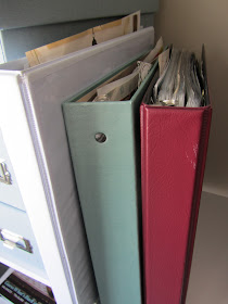
Notebooks with favorite images in plastic sleeves, so I can tote it anywhere like a magazine. If I go with this option, the current ones are out of  here...too ugly!


Magazine storage files. They are the most attractive, but they are heavy and need a very sturdy shelf. Six would be my limit. I've had these for 3 years...labels would be nice don't you think?


As I search for better systems, here are my questions:
  • Do you still buy or subscribe to several magazines?
  • What do you do with an issue after you've read it cover to cover?
                              Recycle? Tear pages out? Save the whole issue?
  • What do you do with saved issues?
  • How long do you save an entire issue?
 Do you dog ear the pages? Load it up with post-its notes to mark favorite pages and items? Other?
  • What do you do with tear pages?
                            Scan? File? If so, what's your method?
  • How long do you keep tear sheets?
You would think as much as I talk about organizing, I could figure this one out. I have a few ideas, but I know that my fellow design/organization obsessed readers are a savvy bunch and probably have some very good ideas I've yet to consider.  Please...share your tips!!!

Monday, February 21, 2011

Is Trend A Four Letter Word?

The word trend is really at risk of being too "trendy" I think. Not when it comes to fashion, we all need to be aware, lest we continue strutting around in the worst offenses ever- also called the 80's. Rather as it relates to the design of interiors. I feel like every time I pick a magazine, lurking around the next page is something telling me "what's hot". Yes, if we are in the business, it's our job to know. But, it's also our job to know trends will come and go and well designed rooms do not need to and should not incorporate all the latest trends.  I know this is hardly a new topic on the blogs and I thought I'd made peace with trends. Turns out I haven't.

Over the weekend I came across an article about houndstooth. Basically, I got my knickers in a bunch over hounthstooth being called "trendy" in this month's  Elle Decor. I happen to like this magazine and have been a longtime subscriber. Nothing trendy on the cover this month. It was an unexpected look of a women's loft office by Bunny Williams and I loved it!


Why is houndstooth a design trend?  It's been around forever. Another thing the Scot's gave us. In fashion, I used to associate it with Geoffrey Beane. Now I think of Chanel. I have a houndstooth skirt that I like, it seems traditional. I'm traditional. Recently, I found a pair of houndstooth shoes that I was madly in love with. The heel was just too high for me. They weren't practical. Besides being traditional, I am practical. Especially when it comes to making purchases for my home or wardrobe. 

My Fairfax ottoman by WSH, covered in brown & cream houndstooth.  Purchased nearly 6 years ago. Does this
mean I was previously un-cool and now I am hip? Please...say it isn't so.

As far as my home, it is highly unlikely anyone will ever going say "your home is so trendy!" Thank god. I think for many, trendy is equated with having style...being stylish.  I like a variety of design elements and styles. I have antiques, retail items along with some modern elements, like glass block lamps. Mostly, I like homes that have things that are reflective of the people who live there and I strive for that in my work. As for houndstooth, I think it's so practical for upholstery, curtains or pillows.  Put it in just about any room, and it works.

When our Golden Retriever was a puppy, she took a little nibble.
 She has no regard whatsoever for trends...imagine that?

Don't get me wrong, I am not at all opposed to the use of  Lucite furniture, garden stools, foo dogs (okay, I am opposed to these only because they remind me of darling Pugs that have gone Cujo) an animal skin rug, antlers, etc...but only when it's reflective of the person's interest and their style.  I am opposed to using them because we read somewhere that we should. In other words, trend alarms are being sounded way too often in my opinion.

One of my favorite tear sheet images. A foyer designed by Nina Griscom. The rug is described as an antique.
Generally, this means a real skin that was from a hunted animal, long before anyone considered it may
cool for decorative reasons. Imagine if the wood console was Lucite and the wood chairs were garden stools?
Would it seem too trendy...would you love it in five years...maybe, maybe not?
I have never purchased a single item ever because I thought it was trendy. I am an emotional buyer. I have to be drawn in by the item. I have to feel like it could live with me for a very long time and I would still find it interesting in 5, 10, or 50 years.  Especially, when it comes to antiques, books, accessories, artwork or collections.

When I was a child I first began a collection of keys. I was fascinated with a diary, clock key as well as the skeleton key to my grandmother's attic. Not only did I think they were pretty, but also mysterious. On one visit I took that attic key home with me- I liked it that much. I also thought by taking it I would be protected  from the scary things that I was convinced were up in the attic! I have been collecting interesting keys ever since. 
The most recent additions to my key collection. The 3 smaller keys given by my son's girlfriend. The 2 large keys
from my husband's travels, found in my stocking. All were among my favorite Christmas gifts this past year.
Yes, they're trendy too. Ridiculous faux keys are being mass produced and can be purchased everywhere. But, I am passionate about them, so the collecting will continue. The same could be said about Ikat. I like it. I just haven't seen a pattern/color that I'm passionate about.  However, I did buy a blue and white Ikat cotton blouse that I love and wore quite a bit last summer. I likely wear it again this summer, Although I am quite sure by then it won't be considered trendy. Perhaps, I will like it even more.

I guess this rambling is really just to express how sick I am of entire rooms that are filled with the items magazines tell us are the latest trends, Worse, when it's passed off as good design. Creative work. Applauded. Granted trend is spelled with five letters, but are we all beginning to say it as much as our other favorite four letter words? Sh*t, I don't know. Maybe I'm crazy? Jaded? Or could it be, you are sick of it too?

Friday, February 18, 2011

Peacock Blue: Take Two

How about a little porn just in time for the weekend? The design kind of course! Actually it's a double feature. Not only do each of these rooms have exquisite peacock blue walls, they also each have gold convex mirrors! I have 3 convex mirrors in my own home. Love those too. This is all good....so good.  I've been going through some tear sheets and don't why I haven't shared these images with you before...so very sorry. Enjoy them and your holiday weekend!

Southern Accents Jan-Feb 2008 designer, Markham Roberts

Traditional Home Holiday 2008 designers Courtney Coleman and Bill Brockschimdt


Southern Accents March-April 2008 Richard Keith Langham
The walls are fabric and much richer in the photo.

Designer Miles Redd. Photograph by Thomas Loof.
A scan does not do this justice! The walls are lacquered
 in Farrow & Ball's Hague Blue.

Tuesday, February 15, 2011

Tuesday Tip

Insider tip. Don't worry, it's legal. Some of you may have already figured this out. Paint prices are on the rise, yet again. As the price of oil continues to go up so will things like paint. The better quality paints, those containing  higher levels of latex will show more dramatic price increases. In the long run though, they're still worth it.

Basement painting...finally getting finished! The color is called Roxbury Carmel.
Even with my trade discount, I got quite a surprise when I popped into my local Benjamin Moore dealer. When I buy BM, I always buy the Aura. And, this trip was expensive. We had re-painted half of the basement....well over a year ago! Ah, yes the cost of waiting.

I was told by the manager they are expecting another price increase soon. I'm guessing just in time for spring. Got a big paint project? For many of you it's a 3 day weekend coming up....time to get rolling!

Monday, February 14, 2011

Happy Heart Day!


Hope your day is full of hugs, kisses and cards from those you love!

Friday, February 11, 2011

Valentine's Weekend Illusions

What is the best way to polish off your box of chocolates this weekend? On the sofa watching a good movie of course! May I suggest one of my favorite movies, The Illusionist. It came out in 2006 and stars Edward Norton as the turn of the century magician, Eisenheim. Paul Giamatti is an inspector and Jessica Biel plays a Duchess. I remember the first time we rented it and literally right after it was over, my husband turned to me and said "do you want to watch it again?"


This is not a chick flick or likely to be found on Cupid's list of cinematic recommendations. It's more of a mystery/drama, but has enough romance to make it quite suitable for Valentine's weekend. The movie, I think, is well-crafted and very stylish. It does takes great liberties with fantasy and illusion, but the acting by Giamatti, Norton and Rufus Sewell (who plays Crown Prince Leopold) should get you well past any criticisms. It takes place in Vienna, Austria and the sets and costumes are fantastic. The ending will likely leave you pondering the many twists and turns. Which is one reason, I'm glad we didn't see when it was released in theaters. If you've never seen it, start early, so you can enjoy a double feature!


Click here for a preview and have a great weekend!!!

Thursday, February 10, 2011

C'mon Baby Light My Fire!

Or just sit with me by the fire and enjoy some wine and chocolate. I do like Valentine's Day...a lot, but not in the scatter rose petals in a path to the bed sort of way. If my husband ever did that it would kill any chance of romance because I wouldn't be able to stop laughing.


We tend to keep it pretty simple most years, and this year we had to celebrate early since Mr. A&A is globe trotting again. I honestly don't know why I haven't considered doing this before...dessert fireside in the library. Just enough to celebrate the holiday without being over the top.


The mini cake came from Trader Joe's and had the authentic aroma of chocolate.
 The roses also from TJ's...gorgeous almost lilac. The little
pink bowls are antique and are perfect for raspberry sorbet!
 This year skip the lavish preparations and try something simple to show your love to the one you love!


Tuesday, February 8, 2011

Tuesday Tip

Garanimals for grown-ups. Gentleman, specifically, today's tip is for you. But ladies don't click away just yet. I've mentioned in a post here and there that some refreshing was going on in the A&A master closet. I think if you want to have a beautiful start to your day, it definitely begins there.

As if we don't have enough collections in our home,  Mr. A&A has had a private one going on for sometime. Not really. As a matter of fact, I knew all about it and was totally fed up with the black & blue collection. It seems my husband has lost the ability to tell black from blue.  When he would get to a point he couldn't tell one sock from the next, he would buy more! An entire deep drawer became dedicated to the sock collection.


I gave up trying to separate them myself awhile ago and from time to time, I have seen him sporting a mismatched pair...and said nothing. Yes, occasionally, I am not a good wife. So when we were doing the little purge and using the beloved folding board, and making each shelf and drawer really beautiful, I came to a stop when I opened that drawer. I got a bag and dumped everything into it. Donated. Hopefully they will find their way to someone with good eyesight.


We went out shopping (Macy's) for new socks. I heart you Ralph Lauren for your brilliant attention to detail. Readers, just in case your not quite getting the exciting special feature of these socks, I'll explain. Each sock color has it's own little coordinating  polo pony color. They are strategically placed on the outside of each sock. So now when they come out of the laundry there will never again be the questions: what color is this and does it have a mate?

Ladies, may I suggest these for a Valentine's present. One that you both will love and that keeps on giving long after the chocolate is gone.

Images courtesy of Ralph Lauren and A&A

Monday, February 7, 2011

Panic Room

There is no underestimating the excitement of working on a new project with someone you have worked with before. Except....when they say they want a newly decorated space using yellow. Then, if you're me, there is a moment of oh, no....please anything but that color.  Instead I casually say great, we could begin by looking at it combined with gray. No. Okay, how about aqua because it's fresh and hip (like she is, not to mention I'm really comfortable with that color). No, not feeling it. Thus, the pangs of anxiety began creeping in.


When our meeting wraps up, I jump into my car. I am going to need help. I take a deep breath, reapply my lipstick, devour my emergency stash, barely minding the grossly substandard ingredients.


Now say the words construction, remodel, renovation, demolition and I am completely enthusiastic and calm. I know my way around this scenario. I feel confident and excited. I know it makes no sense to most, and I can not explain it except to say I have not been in a relationship with yellow since I said goodbye to my yellow and white daisy bedspread when I was about ten.


 As an adult, I can only assume when French Country decorating became very popular, I decided the pairing of yellow and blue was something I disliked. Granted, I've realized over time that it had more to do with the saturated nature of the colors and bold patterns which they accompanied. But even with this understanding, the combination went into my archives labeled as colors I don't like. I also never wear yellow.


I've started the arduous process of searching out fabrics, paint samples, possibly wallpaper in that foreign land called yellow. Oh, these are really pretty and I love houndstooth...but what else to combine it with?


Again, anxiety. So I reached for more fortification. And, by now my fingers are too sticky to do anything, including wrap the little gift on my desk intended to humor a friend.


 I succeeded in making myself completely nauseous and have vowed never to combine anxiety with too much sugar.  I am beginning to get excited about the possibilities of delving into uncharted territory, because there on my desk, seemingly out of nowhere, looks like just the inspiration I needed.

Images courtesy of A&A, Google, Williams-Somoma


Tuesday, February 1, 2011

Tuesday Tip

For those of you who love music from the 70's, you most certainly know the distinct raspy voice of British rock icon, Rod Stewart. His classics such as Maggie May and Tonight's The Night are still regularly played on the radio stations everywhere.

His albums are definitely part of my youth, though he was far too old for me to have a serious crush on. No, that distinction had been reserved for the other blond, guitar wielding and younger 70's  Brit rocker, Peter Frampton. But there was no denying Rod Stewart's sex appeal. Men wanted to be him, women wanted to be with him.


Well fast forward 30+ years. The, just turned, 66 year old still has a trick or two up his sleeve. In 2002 he recorded the first CD in a series called The Great American Songbook. If you haven't already heard of the series and you're looking for some new music or a gift, you're in for a treat. He gives amazing performances of such classics as Time After Time, I've Got You Under My Skin and They Can't Take That Away From Me.

I purchased the first CD out of sheer curiosity shortly after it's debut. The next two I bought because the first was so good! Now I have them all on my iPod. The final installment called The Best of The Great American Songbook is due to be released today. There is a really good interview on Billboard from October 2010 about this collection and you can hear a sampling of the songs on Rod Stewart's web page.


This music is perfect for small gatherings, dinner parties, as well evenings spent sitting by the fire with your favorite elixir. Oh, and of course just what cupid would recommend for Valentine's Day!